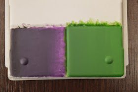
With all things they only get better with practice and this is something that if you have seen my work now needs practice.
So going back to the same style I did with the first attempt of a block of color done over a plastic box if you did not see that you can find it here, but keeping with this I thought I change things up and try something different but again similar and here is the results
The color scheme for this one I thought I would change it up from the purple and
I use the reaper miniature paints and using their triads I decided on Pine green, leaf green and pale green if you paint with reaper and want to see a list of the Triads they can be found here.
Starting off with the three
Then I started blending the dark tone into the mid tone this time using a mix of the two as a glaze. A ratio of 1:1 of pine green and leaf green as well as three drops of water and three drops of glaze medium.
Then I began the process on the lightest tone using the same as the dark tone with a mixture of the light and mid tone to a 1:1 ratio with three parts water and three parts glaze medium.
Now that you can see in the pictures I had made a good mess of it all I needed to bring it all back together and also allow there to be some sort of difference in the color to show some sort of transition from light to dark.
To do this I decided to make a Glaze of only the mid tone and layer over the
I was very pleased with the result that I got from this and I compared to the first attempt it went a lot better. Below you can see a picture of the two next to each other and see the difference yourself.
Next I am going to move away from Glazing and try for the first time feathering.
Again, all comments are welcome good or bad.


A tip on glazes. When aiming for a glaze, the paint should be thin enough that you can run the paint over a piece of paper with printed text on it, and still be able to read the text under the paint. I think the glaze on the green went a bit opaque, and you lost a bit of your blending work. (of course this could just be the photos).
ReplyDeleteI think you are right on this one I could be the type of person who hides behind "Bad Photos" but it's not very good. Also I would like to thank you for your comments. will have to work on glazes more. at the mo I am working on the chaos warriors hope to have something to show next week with more contrast hopefully.
Delete