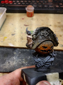
This week I'll be talking through my process of painting the candle on his hat. This won't be a paint recipe guide, put paint A here, then paint B here etc. Instead I'll try and talk about the why of painting the candle, if you have candles in your own projects they might require different colours to fit those models but the principles will be the same. This proved to be quite a challenge. I spent a good amount of time looking at reference pictures to try and help me. I'll share some of these here so you can see how I go about doing this.
I find it helpful loading my images into photoshop (or gimp or whatever editing tool you prefer) and using the colour dropper to make myself a swatch of the various colours in the image. It helps when mixing colours on the palette and just aids in really 'seeing' the image. Here are two good reference photos I found, and you can see quite a drastic colour palette difference to them. I liked the second one better for this bust, it's a closer fit to the lighting I have in mind for the piece although there will be a larger bright section due to the size of the flame on the candle on the bust.
I based the candle with a watered down mix of P3 Menoth White base and a flesh tone (GW Ratskin Flesh I believe)
This was a little too pink so I glazed over it with more menoth white base until I was happy with it. I then worked with more glazes, pushing and pulling until I was close to my reference images. I used a cold blue (I think it's The Fang by GW) for the shadow areas of the candle, more easily seen from the back. The lower areas at the front have been highlighted as they will be lit from the fire in front of the model (out of shot so to speak), same as the rest of the model. Above the blue I used a desaturated red/brown to transition into the 'lit' area of the candle, where the candle light is showing through the wax.
The flame itself was the real tough area. I looked at a lot of photos of how candle flames behave (I even had a lit candle on my desk to look at!) The challenge is that candle flames are not solid objects, painting them as a 3D sculpt I found difficult. Once again I used my trusty photoshop to give me a good reference, I found a photo of a nice large flame. As you can see from the swatch the colours in the flame are actually fairly desaturated, there is no Ferrari red or super intense yellow.
One of the things that makes the flame so hard to paint is that it's translucent, something you just can't do with paint on a sculpt. Most of the candles in miniatures examples (unfortunately mostly at a much smaller scale) I found people just ignored the blue/black area at the bottom of the flame (which is the hottest part) and started at orange/yellow up to white at the tip. Given the larger scale of this candle (both in the bust sense and it being a pretty big flame) I wanted to try and start with the blue/black and work from there. I mixed up a set of colours on the palette from my reference image. You'll also notice that I started by painting the whole flame white. Best base to let me get the bright colours I want.
It was simply a case of adding the colours, blending as I go. From black (with a tip of blue) through to a muddy red, orange, then a desaturated yellow up to near white. I made the brightest part not the tip but about 2/3 up the flame. The tip I added in a small transition back to black.
I'm really happy with how this turned out. It was initially a very intimidating part for me but by breaking it down, and using good reference images I ended up with something I'm very happy with.


No comments:
Post a Comment