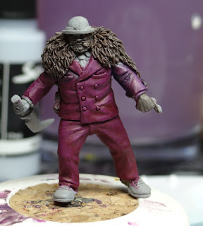
With my Batman gang finished, it's now time to turn my focus back to Purgatory, and that means Hannibal.
As I've already painted one Purgatory piece so far in a white suit - Saint Peter - I decided I needed a different colour for Hannibal, but one that was similarly outgoing. It didn't take me long to settle on purple.
As a starting point, I chose Scale Color's Hastur Purple, which is a fairly rich purple on the warm red side of the spectrum.
I then got my palette prepped for the next stage - these are the paints I put down.
Partway through, after some advice, I swapped from using Artic Blue and Coal Black to these two -
So, now we know what colours I was playing with, here's what I was doing with them. I've never really been able to crack glazing, so I had a little Facebook coaching from Normski and Purgatory's Gary. My aim was to keep the Hastur Purple as a mid tone but to try and create a lot of depth in the suit, thanks to all the shadows that the folds cast.
I started out just working on his left arm as a test, first adding in the shadows, created initially by coal black but then by Stegadon Scale Green, which it turns out is great for creating natural looking shadow. This was glazed in over a few layers and while they were drying, I was adding in highlight layers of a mix of Hastur Purple, Fenrisian Grey and a little Sunset Purple just to keep it from tipping too far to pink.
By this point I was getting a little carried away with the fact that glazing was actually working, so made a start blocking in shadows.
Initially these shades were just added to the folds, but I decided that since I had a lot of shadow on the underside of his arm, he would probably have that arm casting shadow on his side, so both sides for a few layers of SSG. This then carried on with the shadows cast between his legs and by the end of the evening, I'd gotten rather a lot of shading added to him.
The palette, after an evening of glazing.
The next evening, I sat down with the same colours in the palette, but this time my focus was on bringing back the mid tone and to get some highlights going.
There is still quite a way to go on the purple, but it's started to pull together nicely. I've deliberately left his lappels alone so far as I'm quite a messy painter and with both his face and shirt to get at, I'm bound to get some paint on them so left them at the base layer, rather than having to redo them.


Lovely work, looking great so far!
ReplyDelete