A quick colour test this week, let's take a look!
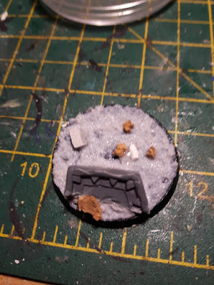
This guy is not finished just yet, but let's see how we got here, first the base, I wanted it to be simple enough to make quickly but still interesting..
I built it up in layers using Vallejo modelling paste and sands, the plastic part is a chopped up part of the arcane runes set.
And grass added:
Now the Orruk:
Basecoats were done rapidly over a white undercoat..
Before highlighting the skin particularly here and then the armour, using a pseudo drybrushing technique:
Happy Painting!


I think you're on the money about the contrast, but I can't really think of what to sugges for the armour.
ReplyDeleteWhat I would say is that the skin tone is possibly lacking a a variety in colour. It's a nice transition from dark green/black to white, but I think you might be able to whip up a bit more contrast in the shadows by glazing in some purple or dark red
Maybe pick out the rivets on the armour in a different colour, perhaps rusted metal, or the blue on the yellow and vice versa?
ReplyDelete